Line chart
Display quantitative values over a continuous interval or time period by creating a line chart.
Details
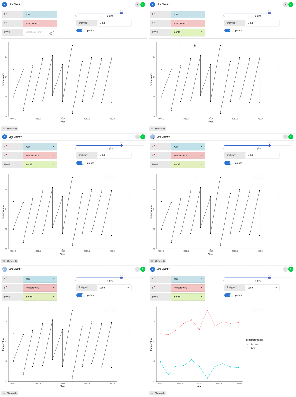
Create a line chart by selecting a continuous interval or time period variable (x) along with a continuous variable (y). Add a categorical grouping value which will split and colour the lines accordingly. Customise your plot further by selecting the line type, alpha (opacity) and whether the data points should be visible.
Output
The example line chart below shows the mean January and June air temperatures for Sao Paolo between 1950 and 1960.

Parameters
| Variable name | Required | Constraints | Description |
|---|---|---|---|
| x | Yes | Column Input. Integer, Decimal | The categories in this column will form the x-axis of the plot and a bar will be created for each category. |
| y | Yes | Column Input. Integer, Decimal | The values in this column will form the y-axis of the plot and a bar will be created for each value, corresponding to the respective x-axis parameter. |
| group | No | Column Input. Text, Integer, Boolean, Date, DateTime | The categories of this column will be used to group and colour the lines. |
| alpha | Yes | Decimal between 0 and 1 | Dictate the transparency of the lines with 0 being completely transparent and 1 being completely opaque. |
| linetype | Yes | Select value | Specify the style of line for your line chart, defaulting to solid line. Choose from: twodash, longdash, dotted, dotdash and dashed. |
| points | Yes | Boolean | Toggle the line chart data points on and off. |
See Also
Updated on November 06, 2025
