Frequency bar chart
Show discrete, numerical comparisons across categories by creating a bar chart with bar heights proportional to the number of cases in each group.
Details
The classic bar chart uses either horizontal or vertical bars (column chart) to show discrete, numerical comparisons across categories. One axis of the chart shows the specific categories being compared and the other axis represents a discrete value scale. One major flaw with bar charts is that labelling becomes problematic when there are a large number of bars.
Bars charts are distinguished from histograms, as they do not display continuous developments over an interval. A bar chart's discrete data is categorical data and therefore answers the question of "how many?" in each category.
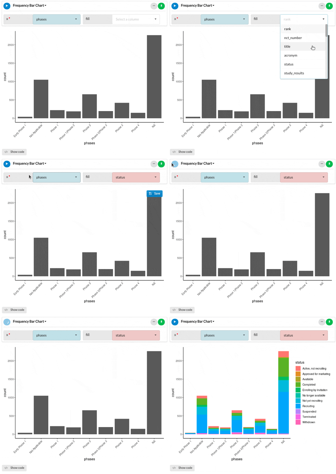
Create a bar chart by selecting a categorical variable (X). This plot will return the count for each instance of X supplied, plotting each value on the Y-axis. Add another categorical fill variable in order to split the bars accordingly.
Output
The example frequency bar chart below illustrates the number of clinical COVID-19 trials at each phase grouped by the trial status.

Parameters
| Variable name | Required | Constraints | Description |
|---|---|---|---|
| x | Yes | Column Input. Text, Integer, Boolean, Datetime (with timezone), Date | The categories in this column will form the x-axis of the plot and a bar will be created for each category. |
| fill | No | Column Input. Text, Integer, Boolean, Datetime (with timezone), Date | The categories of this column will be used to populate the group and fill optional parameters. Group will segment the x-axis bars dependent on the group's categories, with fill colouring the bar accordingly. |
