Column bar chart
Show discrete, numerical comparisons across categories by creating a bar chart with bar heights proportional to the values in a numeric column.
Details
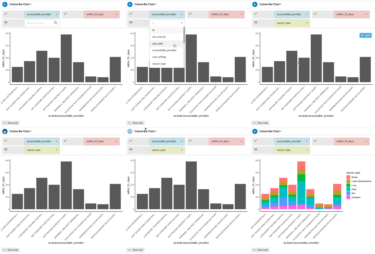
Create a bar chart by selecting a categorical variable (X) and a numerical variable (Y). The Y numerical variable can be calculated manually before, or passed and handled automatically by the module. Add a categorical fill variable in order or colour and segment your bars.
Output
The example column bar chart below illustrates the number of patients at each hospital who received their first treatment within 31 days after diagnosis grouped by the type of cancer.

Parameters
| Variable name | Required | Constraints | Description |
|---|---|---|---|
| x | Yes | Column Input. Text, Integer, Boolean, Date, DateTime | The categories in this column will form the x-axis of the plot and a bar will be created for each category. |
| y | Yes | Column Input. Integer, Decimal | The values in this column will form the y-axis of the plot and a bar will be created for each value, corresponding to the respective x-axis parameter. |
| fill | No | Column Input. Text, Integer, Boolean, Date, DateTime | The categories of this column will be used to populate the group and fill optional parameters. Group will segment the x-axis bars dependent on the group's categories, with fill colouring the bar accordingly. |
See Also
Updated on November 06, 2025
