Scatter plot
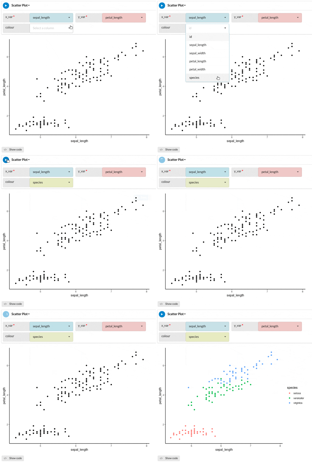
Show the relationship between two numeric data variables by creating a scatterplot. A third data variable can be compared by mapping it to the colour of the points.
Details
Scatterplots use a collection of points placed using Cartesian coordinates to display values from two variables. By displaying a variable in each axis, you can detect if a relationship or correlation between the two variables exists.
Note that scatterplots can suffer from overplotting for larger data tables where points may be plotted on top of one another. Scatterplots are ideal when you have paired numerical data and you want to see if one variable impacts the other. However, do remember that correlation is not causation and another unnoticed variable may be influencing results.
Output
The example scatter plot below shows the petal length plotted against sepal length, while the scatter colour corresponds to the flower species.
Parameters
| Variable name | Required | Constraints | Description |
|---|---|---|---|
| x_var | Yes | Column Input. Decimal, Integer | The values of this column will mapped continuously to the x-axis of the plot. |
| y_var | Yes | Column Input. Decimal, Integer | The values of this column will mapped continuously to the y-axis of the plot. |
| colour | No | Column Input. Decimal, Integer, Text, Boolean, Date, Datetime | The values of this column will be mapped to a colour scale for the plot. The points of the plot will be coloured depending on the values in this column. For categorical data like Text or Boolean, contrasting colours will be used for each category. For numeric data, a continuous colour scale will be used. |
