Histogram
Visualise the distribution of a single continuous variable by creating a histogram displaying the tabulated frequency in discrete intervals of the data.
Details
A histogram visualises the distribution of data over a continuous interval or certain time period. Each bar in a histogram represents the tabulated frequency at each interval/bin.
Histograms help give an estimate as to where values are concentrated, what the extremes are and whether there are any gaps or unusual values. They are also useful for giving a rough view of the probability distribution.
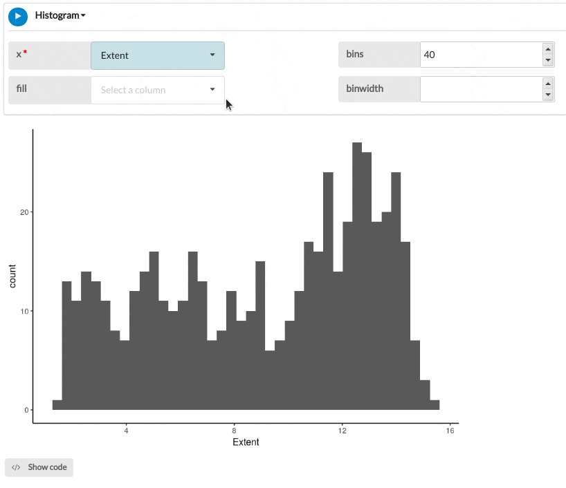
Output
The example below shows a histogram of sea ice extent in the 1978-2018 period grouped by location.
Parameters
| Variable name | Required | Constraints | Description |
|---|---|---|---|
| x | Yes | Column Input. Decimal, Integer | The column you want to create a histogram for. The values in this column will be divided into bins based on the bins or binwidth inputs. |
| fill | No | Column Input. Text, Integer, Boolean, Date, DateTime Maximum of 15 categories. | The categories of this column will be used to split each bar in the histogram into different segments. The segments will be coloured by category and a legend created. |
| bins | No | Integer > 0 | Number of bins to split the x-axis into. Overridden by binwidth. Defaults to 30 with a warning if not specified. |
| binwidth | No | Numeric | The width of the bins to divide x into. Overrides bins if specified. |
See Also
Updated on November 06, 2025