

Area chart
Area graphs are used to display the development of numerical values over an interval or time period.
Details
Area charts are conceptually similar to line charts as they display quantitative values over a continuous interval or time period. First drawn by plotting data points and joining a line, the area below the line is then filled with a specified variable or colour.
Select a continuous interval or time period variable (x) along with a numerical variable (y) to create a basic plot. Add in a categorical fill variable to group the area charts based on the values selected, and colour them accordingly. Select a summary_function in order to perform basic statistics upon the y variable selected.
Output
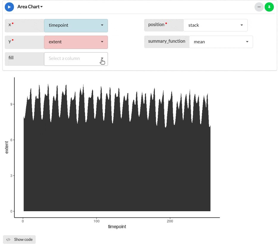
The area chart below shows the sea ice extent in Antarctica and the Arctic between 1990 and 2011.
Parameters
| Variable name | Required | Constraints | Description |
|---|---|---|---|
| x | Yes | Column Input. Text, Integer, Decimal, DateTime, Date | The values of this column will be mapped onto the X-axis. |
| y | Yes | Column Input. Integer, Decimal | The values of this column will be mapped onto the Y-axis. |
| fill | No | Text, Decimal, Integer max. 20 values | Add a fill variable to group the area chart based on categories within the selected column. |
| position | Yes | Choose between stack and fill Default to stack | Toggle between whether the area chart is stacked, or filled to the area of the plot, proportionally. |
| summary_function | Yes | Choose from none, min, max, mean, median and sum Default to none | Apply a range of R summary options to the fill variables, or none. |