

Radar Chart
Plot the mean or median values of up to eight variables from a data table on a single radar chart.
Details
A Radar (or Spider) chart is used to visualise the mean or median values of multiple variables from a data table.
Radar charts can be used to get a quick insight into scale for different properties and compare how the average values differentiate between variables.
Output
The example below shows how to use the Radar chart module to plot the mean values of the flowers petal length, sepal length and width measurements.
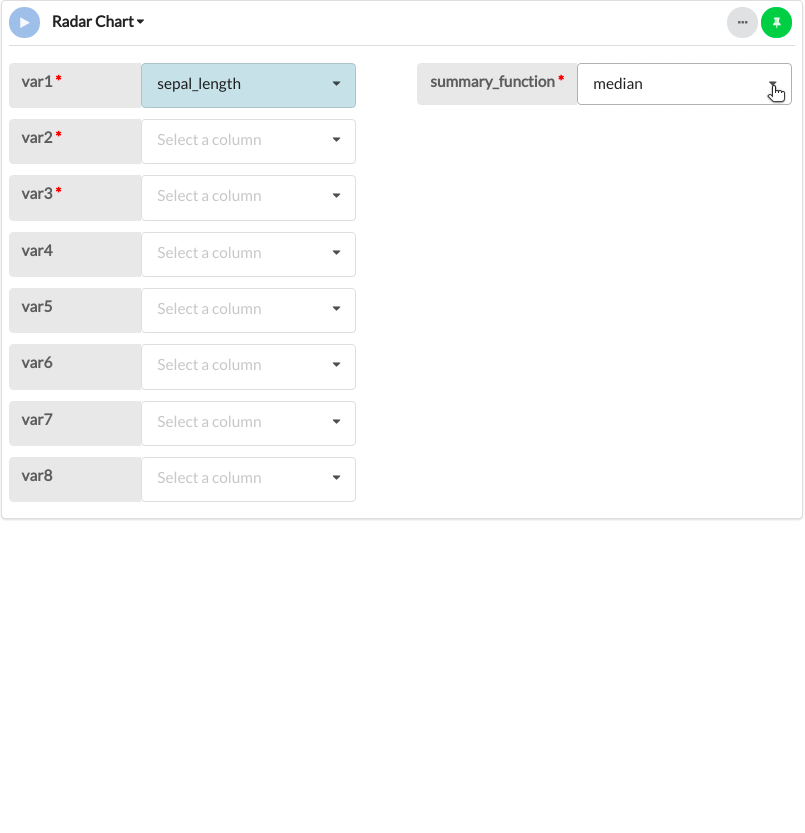
Parameters
| Variable name | Required | Constraints | Description |
|---|---|---|---|
| Summary Function | Yes | Select from two options | The function to be used to summarise the columns data. Either mean or median |
| var1 | Yes | Column Input. Text, Integer | Numerical variable to be summarised and plotted. |
| var2 | Yes | Column Input. Text, Integer | Numerical variable to be summarised and plotted. |
| var3 | Yes | Column Input. Text, Integer | Numerical variable to be summarised and plotted. |
| var4 | No | Column Input. Text, Integer | Numerical variable to be summarised and plotted. |
| var5 | No | Column Input. Text, Integer | Numerical variable to be summarised and plotted. |
| var6 | No | Column Input. Text, Integer | Numerical variable to be summarised and plotted. |
| var7 | No | Column Input. Text, Integer | Numerical variable to be summarised and plotted. |
| var8 | No | Column Input. Text, Integer | Numerical variable to be summarised and plotted. |
Updated on October 16, 2023